plot_spiechart generates for each indicator in the scoring
tibble a ggplot2-based spie chart to visualize the scores of each
criterion.
plot_spiechart(
  summary_tbl,
  col_press_type = NULL,
  col_crit8_11 = NULL,
  lab_size = 6,
  title_size = 8
)
Arguments
| summary_tbl | The output tibble from the
|
|---|---|
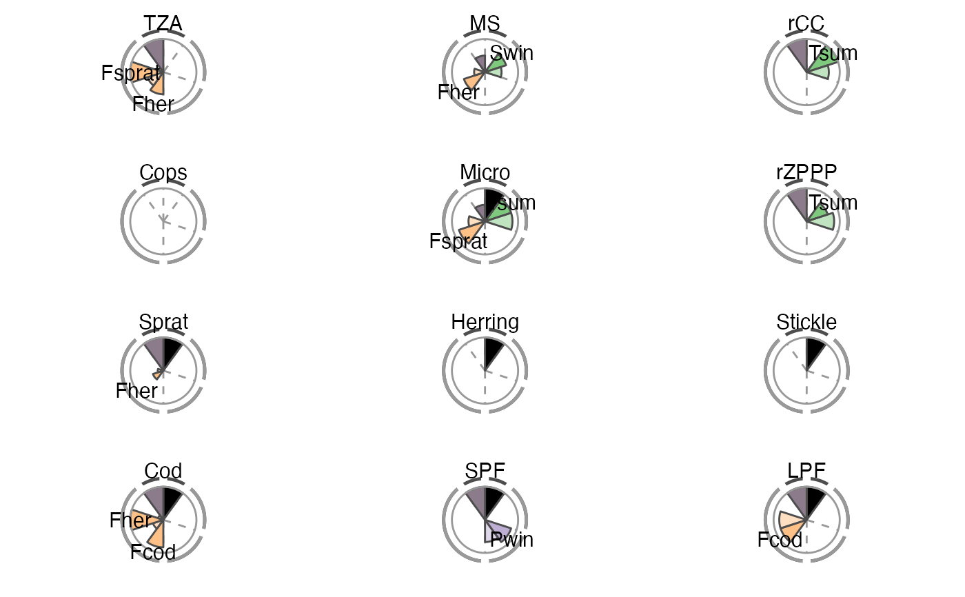
| col_press_type | Colors for the spie chart slices representing criteria 9 (sensitivity; opaque) and 9 (robustness; transparent). The colors distinguish the different pressure types. The default is set to the RColourBrewer palette "Set1". |
| col_crit8_11 | Colors for the spie chart slices representing criteria 8 (trend) and 11 (management application). The default is set to cyan1 and yellow2. |
| lab_size | Size for the labels naming the significant pressures. The default is 6. |
| title_size | Size for the title naming the indicator. The default is 8. |
Value
The function returns a list of ggplot objects.
Details
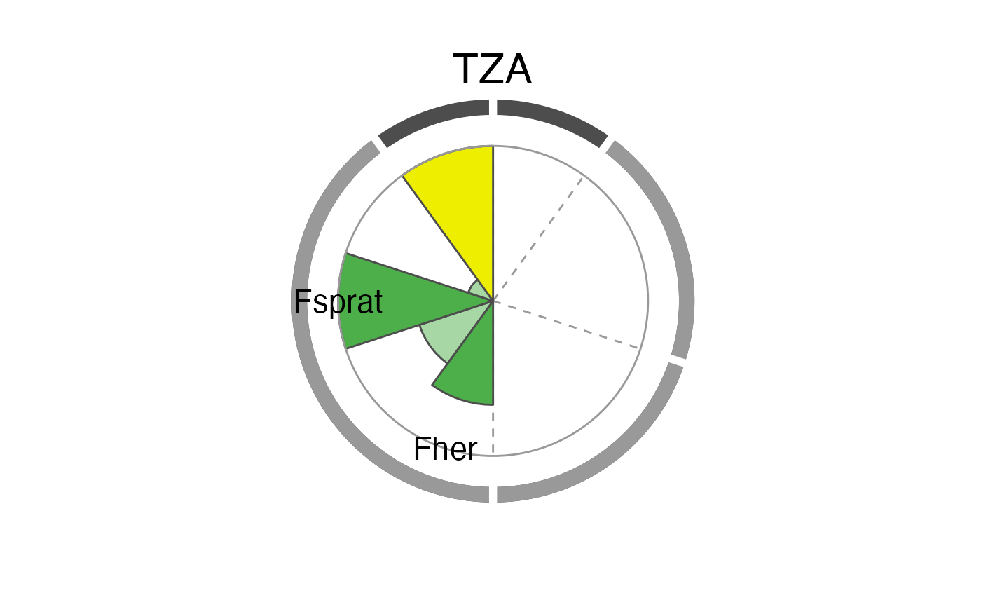
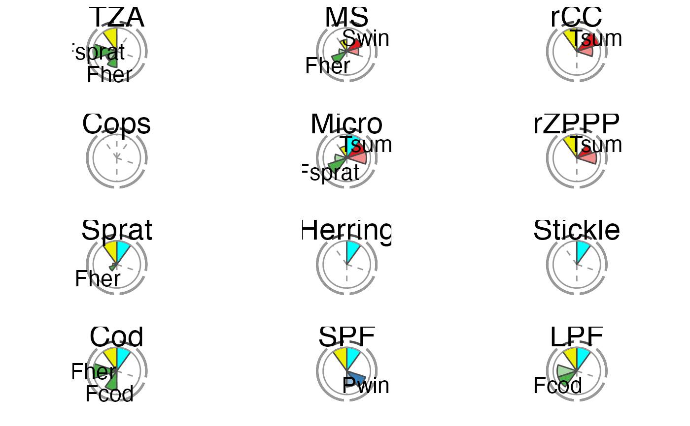
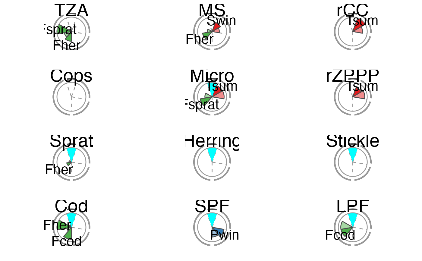
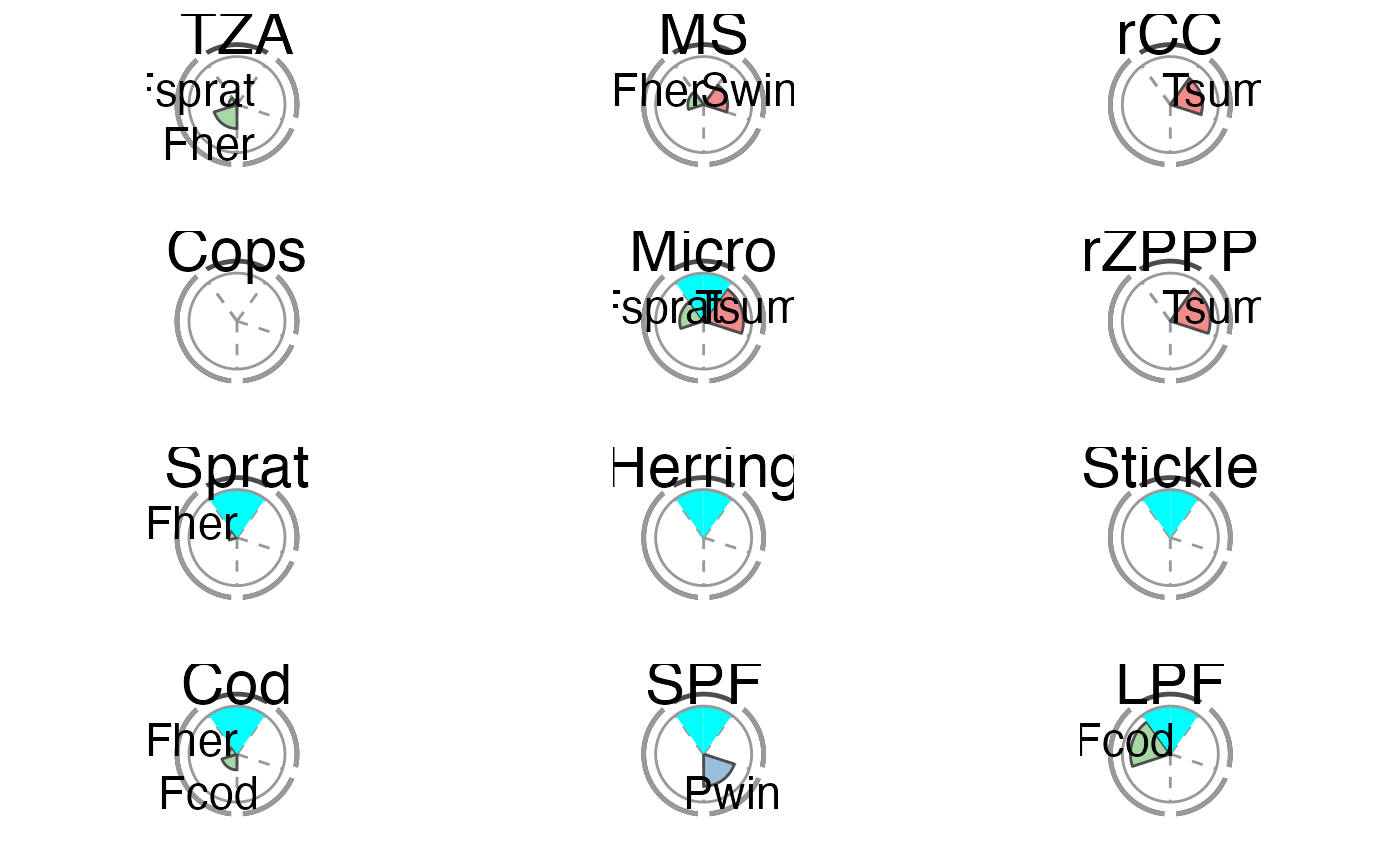
The overall performance of each tested IND is illustrated using a spie chart, which has been shown to be a well-suited graphical tool for displaying multivariate data in comparative indicator evaluations (Stafoggia et al., 2011). A spie chart superimposes a normal pie chart with a modified polar area chart to permit the comparison of two sets of related data, e.g. the maximum achievable scores and each IND’s realized scores. In this function, the slice width is kept constant, while the length of the slices represents the percentage of scores achieved, with the boundary line (i.e. the inner gray circle) indicating the full 100
The two unlabeled slices at the top represent the trend (right) and management (left) criteria. The sensitivity and robustness scores are shown individually for each pressure where a significant relationship was found. These are the labeled slices grouped by their pressure type represented by dotted division lines and the segmented outer gray circle as well as pressure type-specific colors (sensitivity scores are displayed in opaque color, robustness scores in transparent color).
The plot slices adjust to the number of criteria used for the scoring function (that are present in crit_scores_tmpl).
References
Stafoggia, M., Lallo, A., Fusco, D., Barone, A.P., D`Ovidio, M., Sorge, C., Perucci, C.A. (2011) Spie charts, target plots, and radar plots for displaying comparative outcomes of health care. Journal of Clinical Epidemiology 64, 770-778.
See also
Other score-based IND performance functions:
clust_sc(),
dist_sc_group(),
dist_sc(),
expect_resp(),
plot_clust_sc(),
scoring(),
summary_sc()
Examples
# Using the Baltic Sea demo data in this package scores_tbl <- scoring(trend_tbl = model_trend_ex, mod_tbl = all_results_ex, press_type = press_type_ex) summary_tbl <- summary_sc(scores_tbl) p <- plot_spiechart(summary_tbl) p$TZA#> Warning: Removed 2 rows containing missing values (position_stack).#> Warning: Removed 2 rows containing missing values (position_stack).#> Warning: Removed 2 rows containing missing values (position_stack).# To modify the plot p <- plot_spiechart(summary_tbl, col_crit8_11 = c("black", "thistle4"), col_press_type = RColorBrewer::brewer.pal(3, name = "Accent"), lab_size = 4, title_size = 4) gridExtra::grid.arrange(grobs = p)#> Warning: Removed 2 rows containing missing values (position_stack).#> Warning: Removed 2 rows containing missing values (position_stack).#> Warning: Removed 2 rows containing missing values (position_stack).# Remove pressure-independent criteria for the plot (e.g. # management) (easiest in the score tibble) scores_tbl$C11 <- NULL summary_tbl <- summary_sc(scores_tbl) p <- plot_spiechart(summary_tbl) gridExtra::grid.arrange(grobs = p)#> Warning: Removed 2 rows containing missing values (position_stack).#> Warning: Removed 2 rows containing missing values (position_stack).#> Warning: Removed 2 rows containing missing values (position_stack).# Exclude additionally one pressure-specific criterion # (e.g. sensitivity C9) (easiest by removing columns # in the first list of the summary) summary_tbl[[1]] <- summary_tbl[[1]][ , ! names(summary_tbl[[1]]) %in% c("C9", "C9_in%")] p <- plot_spiechart(summary_tbl) gridExtra::grid.arrange(grobs = p)#> Warning: Removed 2 rows containing missing values (position_stack).#> Warning: Removed 2 rows containing missing values (position_stack).#> Warning: Removed 2 rows containing missing values (position_stack).# }