Datenanalyse mit R
7 - Visualisierung in R
Saskia A. Otto
BSH 11/02 - 13/02 2019
Zur Erinnerung ...
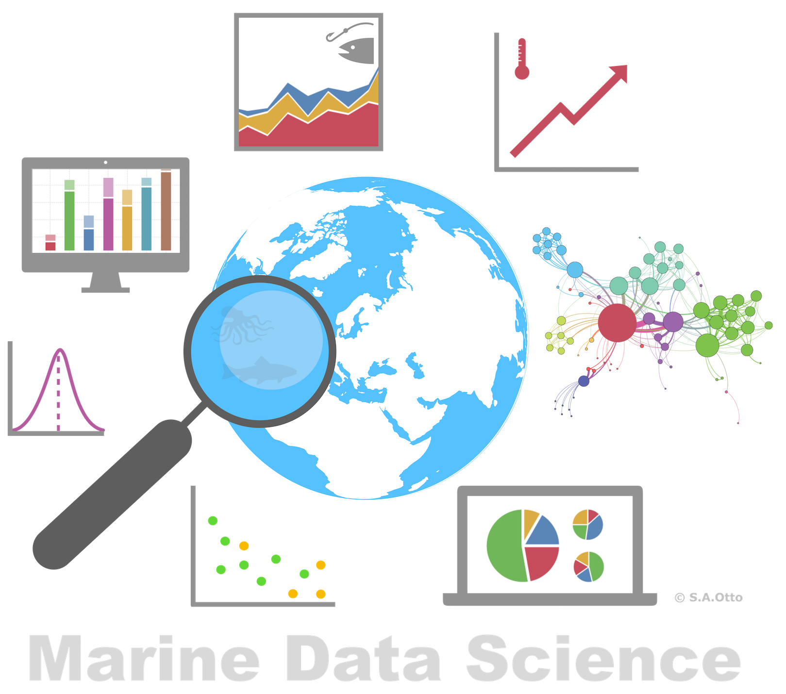
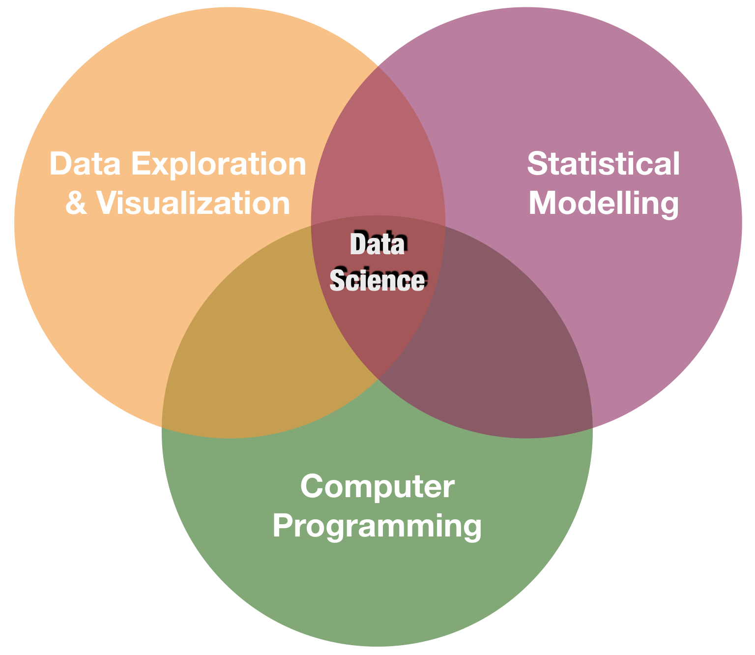
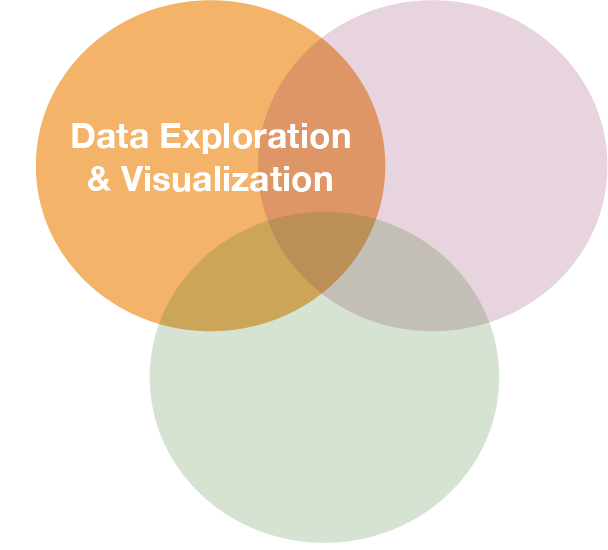
Visualisierung ist eines der Kernpunkte in data science
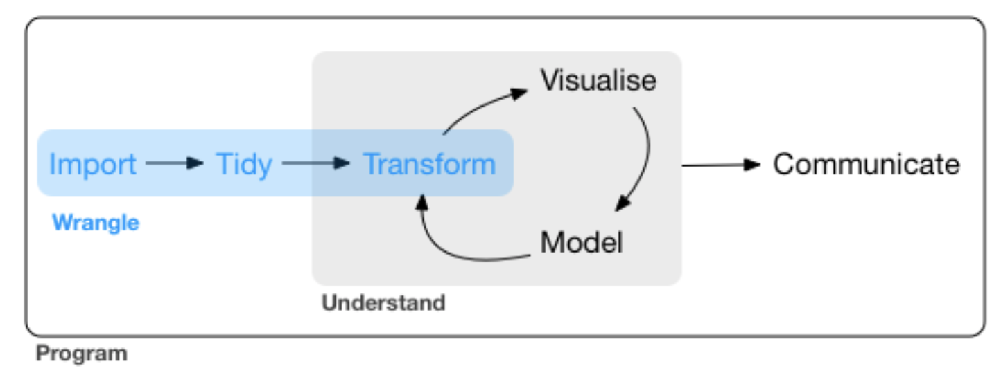
source: R for Data Science by Wickam & Grolemund, 2017 (licensed under CC-BY-NC-ND 3.0 US)
2 verbreitete Typen
- Basisgrafiken
– Funktionen sind bereits Bestandteil der Basis version
– Gut geeignet für eine einfache und schnelle Datenexploration
- Nicht sehr intuitiv und weniger geeignet für komplexe Grafiken
- Keine gute Hilfe bzw. Dokumentation
- ggplot2
– Besser geeignet bei komplexeren Grafiken
– Klarere Syntax- Besser dokumentiert
- Viele Beispiele im Internet
Basisgrafiken in R
Es gibt 2 verschiedene Arten von Grafikfunktionen:
High-level: erstellt vollständige Grafiken (mit Achsen, Beschriftungen, etc.)
plot(x = iris$Sepal.Length,
  y = iris$Sepal.Width)

Low-level: fügt Elemente in den aktuellen Plot
plot(x = iris$Sepal.Length,
  y = iris$Sepal.Width)
abline(h = 3, col = 2, lty = 2, lwd = 5)

High-level Grafiken
| Funktion | Beschreibung |
|---|---|
| plot() | Generische Funktion mit vielen Methoden (kontextabhangig) |
| barplot() | Stabdiagram |
| boxplot() | Boxplot |
| contour() | Plot mit Hohenlinien |
| coplot() | Conditioning Plots |
| curve() | Kurven uber einem Intervall fur eine Funktion |
| hist() | Histogramm |
| image() | Erstellt kontextabhäangige Bilder (auch in 3D) |
| mosaicplot() | Mosaikplot fur kategorielle Daten |
| pairs() | Streudiagramm-Matrix fur paarweise Gegeüuberstellungen |
| pie() | Tortendiagramm |
| qqplot() | QQ-Plot |
High-level Grafiken

High-level Grafik (Forts.)
- Können über ihre Argumente modiziert und angepasst werden.
- In den Hilfen
?plotund?plot.defaultwerden viele Argumente von Grafikfunktionen genannt und erklärt. - Es gibt jedoch auch globale Einstellungen füur Grafiken, die alle nachfolgenden Grafiken verändern können:
par(). - Die Hilfe von
?parlistet wesentlich mehr Argumente, die auch in den high-level Funktionen genutzt werden können.
Wichtige grafische Parameter
| Argument | Beschreibung |
|---|---|
| adj | Ausrichtung von Text (zentriert,...) |
| axes | Achsen sollen (nicht) eingezeichnet werden |
| bg | Hintergrundfarbe der Grafik |
| bty | Art der Box um die gezeichnete Grafik |
| cex | Größe der Schriftzeichen in der Grafik |
| col | Farben (der Linien, der Punkte, etc.) |
| las | Ausrichtung der Achsenbeschriftung |
| lty,lwd | Linientype (gestrichelt,...) und Linienbreite |
| main,sub | Überschrift und Unterschrift) |
| mfrow | mehrere Grafiken in einem Bild |
| pch | Darstellung eines Punktes |
| type | Typ der Darstellung (Linien, Punkte, Nichts) |
| xlab,ylab | x-/y-Achsenbeschriftung |
| xlim,ylim | Größe der Grafik in x-/y-Richtung |
Wichtige grafische Parameter (Forts.)

Wichtige Low-Level Grafikfunktionen
| Funktion | Beschreibung |
|---|---|
| abline() | Zeichnet eine kontextabhängige Linie |
| arrows() | Zeichnet Pfeile |
| axis() | Zeichnet Achsen (jede Achse einzeln!) |
| grid() | Zeichnet ein Gitternetz |
| legend() | Erstellt eine Legende im Plot |
| lines() | Zeichnet schrittweise Linien |
| mtext() | Schreibt Text in den Rand (s.unten) |
| points() | Zeichnet Punkte |
| polygon() | Zeichnet ausgefüllte Polygone |
| rect() | Zeichnet (vektorwertig) ein Rechteck |
| segments() | Zeichnet (vektorwertig) Linien |
| text() | Schreibt Text in den Plot |
| title() | Beschriftet den Plot |
Ausgabeformate

Ausgabeformate
plot(1:10)
→ Die Ausgabe erscheint per default auf dem Bildschirm
pdf('Grafik1.pdf') # Device wird gestartet
plot(1:10) # Grafik wird erstellt
points(0.5:9.5, col=1:10, pch=1:10) # Erweiterungen
#... weitere Erweiterungen an der Grafik
dev.off() # Device muss geschlossen werden
Das Schließen mit dev.off() ist besonders wichtig, sonst werden alle folgenden Grafiken mit in dem PDF angespeichert und nicht in der Konsole anzezeigt!
Aufgabe
Quiz 1: Grafik erstellen und abspeichern
Versuche folgenden Plot mit dem iris Datensatz zu reproduzieren und diesen als PDF abzuspeichern:

Visualization with ggplot2
A system for creating graphics
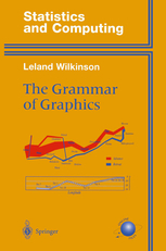
- Based on "The Grammar of Graphics"
- The fundament for plotting in R nowadays
- Well documented
- http://ggplot2.tidyverse.org
- http://ggplot2.org
- complete book (online version)
- Getting help: ggplot2 mailing list
- An increasing number of ggplot2 extensions developed by R users in the community
Creating plots in a stepwise process
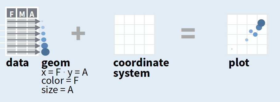
- Start with
ggplot(data, mapping = aes())where you supply a dataset and (default) aesthetic mapping - Add a layer by calling a
geom_function - Then add on (not required as defaults supplied)
- scales like
xlim() - faceting like
facet_wrap() - coordinate systems like
coord_flip() - themes like
theme_bw()
- scales like
- Save a plot to disk with
ggsave()
source of image (topright): older version of Data Visualization with ggplot cheat sheet (licensed under CC-BY-SA)
Creating plots in a stepwise process
- Start with
ggplot(data, mapping = aes())where you supply a dataset and (default) aesthetic mapping - Add a layer by calling a
geom_function - Then add on (not required as defaults supplied)
- scales like
xlim() - faceting like
facet_wrap() - coordinate systems like
coord_flip() - themes like
theme_bw()
- scales like
- Save a plot to disk with
ggsave()
aesthetic mapping:
to display values, variables in the data need to be mapped to visual properties of the geom (aesthetics) like size, color, and x and y locations. aes() mappings within ggplot() represent default settings for all layers (typically x and y), otherwise map variables within geom-functions.
Creating plots in a stepwise process
- Start with
ggplot(data, mapping = aes())where you supply a dataset and (default) aesthetic mapping - Add a layer by calling a
geom_function - Then add on (not required as defaults supplied)
- scales like
xlim() - faceting like
facet_wrap() - coordinate systems like
coord_flip() - themes like
theme_bw()
- scales like
- Save a plot to disk with
ggsave()
geom_function:
combines a geometric object representing the observations with aesthetic mapping, a stat, and a position adjustment, e.g., geom_point() or geom_histogram()
Creating plots in a stepwise process
- Start with
ggplot(data, mapping = aes())where you supply a dataset and (default) aesthetic mapping - Add a layer by calling a
geom_function - Then add on (not required as defaults supplied)
- scales like
xlim() - faceting like
facet_wrap() - coordinate systems like
coord_flip() - themes like
theme_bw()
- scales like
- Save a plot to disk with
ggsave()
scales:
control the details of how data values are translated to visual properties (override the default scales)
Creating plots in a stepwise process
- Start with
ggplot(data, mapping = aes())where you supply a dataset and (default) aesthetic mapping - Add a layer by calling a
geom_function - Then add on (not required as defaults supplied)
- scales like
xlim() - faceting like
facet_wrap() - coordinate systems like
coord_flip() - themes like
theme_bw()
- scales like
- Save a plot to disk with
ggsave()
facetting:
smaller plots that display different subsets of the data; also useful for exploring conditional relationships.
Creating plots in a stepwise process
- Start with
ggplot(data, mapping = aes())where you supply a dataset and (default) aesthetic mapping - Add a layer by calling a
geom_function - Then add on (not required as defaults supplied)
- scales like
xlim() - faceting like
facet_wrap() - coordinate systems like
coord_flip() - themes like
theme_bw()
- scales like
- Save a plot to disk with
ggsave()
coordinate system:
determines how the x and y aesthetics combine to position elements in the plot
Creating plots in a stepwise process
- Start with
ggplot(data, mapping = aes())where you supply a dataset and (default) aesthetic mapping - Add a layer by calling a
geom_function - Then add on (not required as defaults supplied)
- scales like
xlim() - faceting like
facet_wrap() - coordinate systems like
coord_flip() - themes like
theme_bw()
- scales like
- Save a plot to disk with
ggsave()
themes:
control the display of all non-data elements of the plot. You can override all settings with a complete theme like theme_bw(), or choose to tweak individual settings
Creating plots in a stepwise process
- Start with
ggplot(data, mapping = aes())where you supply a dataset and (default) aesthetic mapping - Add a layer by calling a
geom_function - Then add on (not required as defaults supplied)
- scales like
xlim() - faceting like
facet_wrap() - coordinate systems like
coord_flip() - themes like
theme_bw()
- scales like
- Save a plot to disk with
ggsave()
ggsave("plot.png", width = 5, height = 5):
Saves last plot as 5’ x 5’ file named "plot.png" in working directory. Matches file type to file extension.
A demonstration with the internal iris data
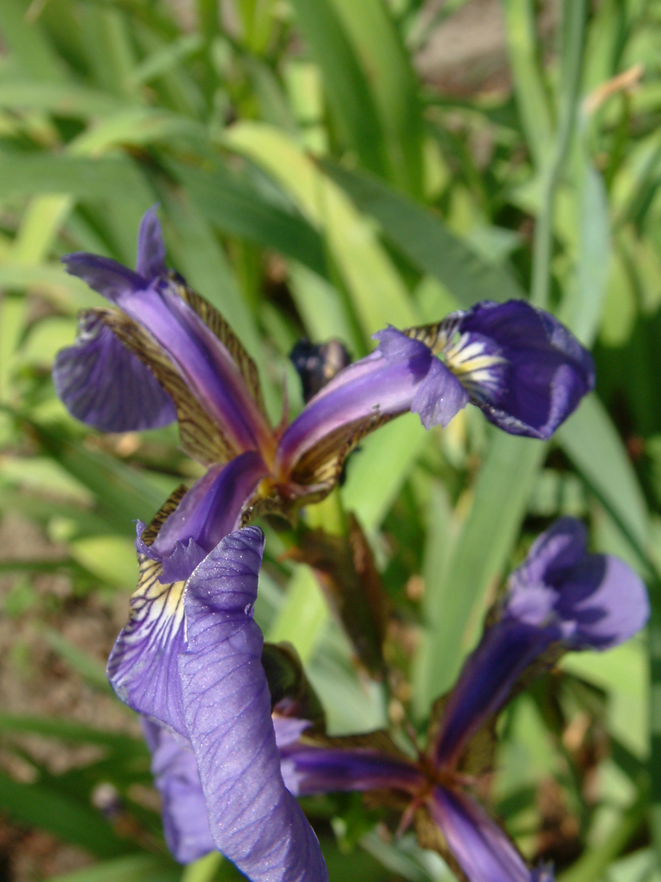
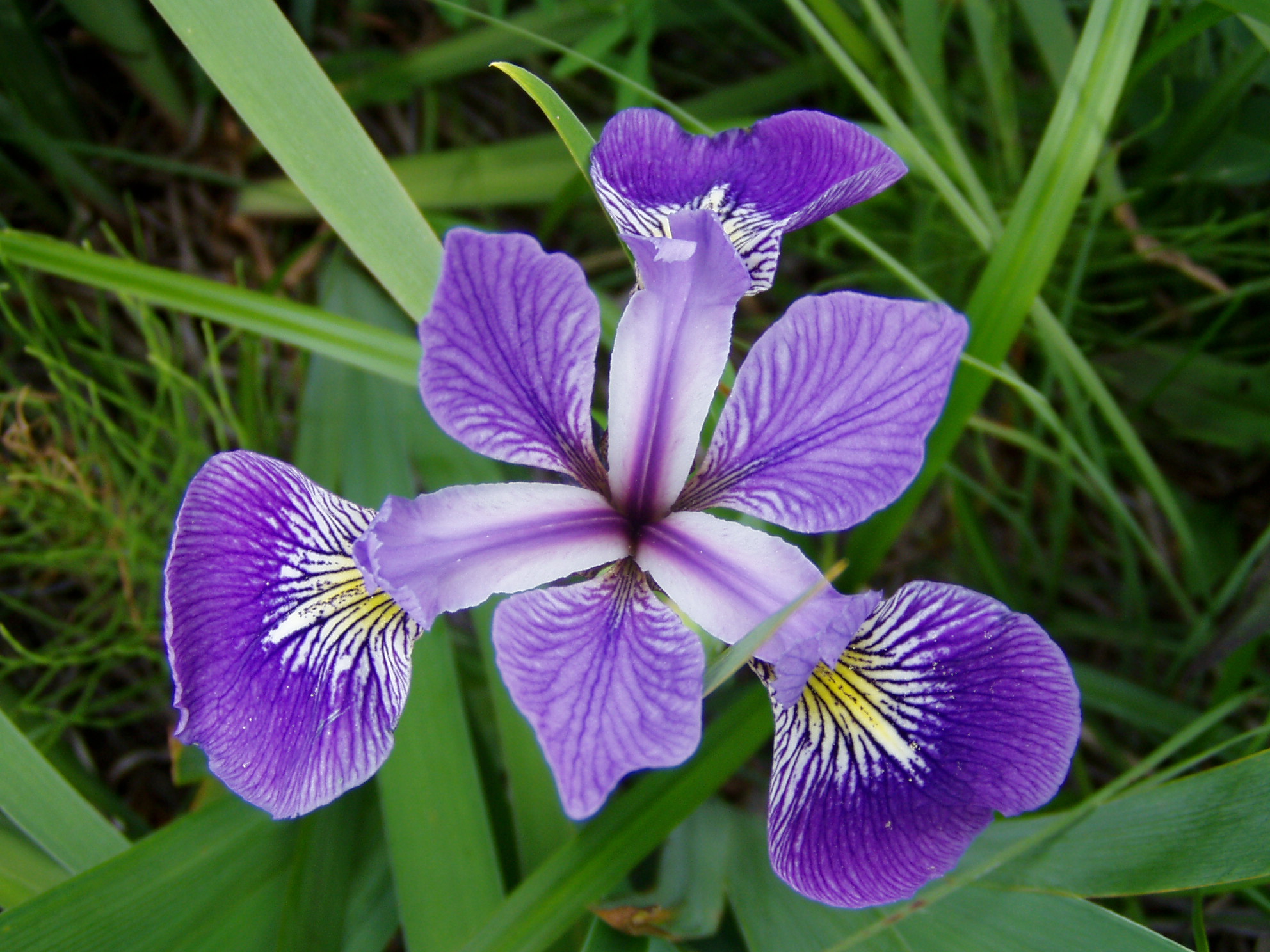
Photos taken by Radomil Binek, Danielle Langlois, and Frank Mayfield (from left to right); accessed via Wikipedia (all photos under CC-BY-SA 3.0 license)
Step 1 - start a plot with ggplot()
ggplot(iris, aes(x = Sepal.Length,
    y = Petal.Length))

Step 2 - add layers: geom_point()
ggplot(iris, aes(x = Sepal.Length,
    y = Petal.Length)) +
  geom_point()

Step 2 - add layers: geom_point()
ggplot(iris, aes(x = Sepal.Length,
    y = Petal.Length)) +
  geom_point(aes(col = Species))
aes(col = Species)
Show points in species-specific colours.
Step 2 - add layers: geom_smooth()
ggplot(iris, aes(x = Sepal.Length,
    y = Petal.Length)) +
  geom_point(aes(col = Species)) +
  geom_smooth()

Step 2 - add layers: geom_smooth()
ggplot(iris, aes(x = Sepal.Length,
    y = Petal.Length)) +
  geom_point(aes(col = Species)) +
  geom_smooth(aes(col = Species),
    method = "lm")
aes(col = Species), method = "lm"
Make smoother species-specific and linear.
Step 2 - add layers
ggplot(iris, aes(x = Sepal.Length,
    y = Petal.Length, col = Species)) +
  geom_point() +
  geom_smooth(method = "lm")
ggplot() (so it becomes the default setting for all added layers).
Step 3 - add scales: scale_colour_brewer()
ggplot(iris, aes(x = Sepal.Length,
    y = Petal.Length, col = Species)) +
  geom_point() +
  geom_smooth(method = "lm") +
  scale_colour_brewer()

Step 4 - add facets: facet_wrap()
ggplot(iris, aes(x = Sepal.Length,
    y = Petal.Length, col = Species)) +
  geom_point() +
  geom_smooth(method = "lm") +
  scale_colour_brewer() +
  facet_wrap(~Species, nrow=3)
facet_wrap(~Species, nrow=3)
Divide the species-specific observations into different panels.
Step 5 - modify coordinate system: coord_polar()
ggplot(iris, aes(x = Sepal.Length,
    y = Petal.Length, col = Species)) +
  geom_point() +
  geom_smooth(method = "lm") +
  scale_colour_brewer() +
  facet_wrap(~Species, nrow=3) +
  coord_polar()

Step 6 - change the look of non-data elements: theme_dark()
ggplot(iris, aes(x = Sepal.Length,
    y = Petal.Length, col = Species)) +
  geom_point() +
  geom_smooth(method = "lm") +
  scale_colour_brewer() +
  facet_wrap(~Species, nrow=3) +
  coord_polar() +
  theme_dark()

Step 7 - save the plot: ggsave()
ggplot(iris, aes(x = Sepal.Length,
    y = Petal.Length, col = Species)) +
  geom_point() +
  geom_smooth(method = "lm") +
  scale_colour_brewer() +
  facet_wrap(~Species, nrow=3) +
  coord_polar()

ggsave("Iris_length_relationships.pdf", width = 4, height = 4)
The last plot displayed is saved (as default).
ggplot - geom_functions
When to use which function?
That depends on
- what you want to display (your question)
- and the type of data
Common plots are ...
Visualize frequency distributions
BARPLOTS -
are used for categorical or discrete variables. Bars do not touch each other; there are no ‘in-between’ values.

HISTOGRAMS and DENSITY PLOTS (can be combined) are used for continuous variables and are often used to check whether variables are normally distributed. Bars touch each other in histograms.

Compare groups
BOXPLOTS - are used to compare two or more groups in terms of their distributional center and spread. They transport a lot of information and should be computed in every data exploration! You can check,
- differences in average y values between groups and whether these might be significant,
- if group variances differ,
- whether individual groups are normally distributed
- identify outlier

Show relationship between 2 variables
SCATTERPLOTS -
are the most basic plots for continuous variables. They are also the least interpreting plots as they show every observation in the 2-dimensional space.

Another useful feature is that they can be combined with other plotting elements: defining aesthetics for a 3rd variable (e.g. colours of points) or adding regression or smoothing lines to help visualise the relationship:

An overview of core geom_functions depending on the type of data:
Elements taken from older version of ggplot cheat sheet
Some examples with the ICES hydro data
Daten laden
load("data/hydro.R")
# Umwandlung Monat zu kategorischer Variable: Faktor
hydro$fmonth <- as.factor(hydro$month)
Scatterplot: Räumliche Verteilung der Stationen, nach Monat farblich gekennzeichnet
Note:
Um eine diskrete Skala zu erhalten wird wieder fmonth verwendet.hydro_sub <- hydro %>%
select(fmonth,station,lat,long) %>%
distinct()
ggplot(...

Lösung
hydro_sub <- hydro %>%
 select(fmonth,station,lat,long) %>%
 distinct()

ggplot(hydro_sub, aes(x = long,
    y = lat, col = fmonth)) +
  geom_point()

Scatterplot: Korrelation zwischen Temperatur und Salzgehalt

Lösung
ggplot(hydro, aes(x = psal, y = temp, col = day)) +
  geom_point()

Histogram: Verteilung (aller) Temperaturwerte
Note:
Wir können auch den pipe Operator beim Plotten verwenden und die Grafik abspeichern um sie uns anschl. anzuschauen!p <- hydro %>% ggplot(...
p

Lösung
Note:
Wir können auch den pipe Operator beim Plotten verwenden und die Grafik abspeichern um sie uns anschl. anzuschauen!p <- hydro %>% ggplot(aes(x = temp)) +
geom_histogram()
p

Barplot: Frequenz der monatlichen Probenahmen
Wichtig ist beim Barplot, dass die X-Variable kategorisch ist (fmonth):
hydro_sub <- hydro %>%
 select(fmonth, station, date_time) %>%
 distinct()
ggplot(...

Lösung
Wichtig ist beim Barplot, dass die X-Variable kategorisch ist (fmonth):
hydro_sub <- hydro %>%
 select(fmonth, station, date_time) %>%
 distinct()
ggplot(hydro_sub,aes(x=fmonth)) +
  geom_bar()

Boxplot: vergleich der monatlichen Oberflächentemperatur
hydro %>% filter(pres < 5) %>%
  group_by(fmonth, station, date_time, cruise) %>%
  summarise(mean_sst = mean(temp)) %>% ungroup() %>%
ggplot(...)

Lösung
hydro %>% filter(pres < 5) %>%
  group_by(fmonth, station, date_time, cruise) %>%
  summarise(mean_sst = mean(temp)) %>% ungroup() %>%
ggplot(aes(x = fmonth, y = mean_sst)) +
  geom_boxplot(outlier.colour = "red")

How do you feel now.....?
Totally confused?

Try to reproduce some of the plots in this presentation and the quiz and read chapter 3 on data visualization in 'R for Data Science' .
Totally bored?

Then figure out how to get a CTD profile in ONE panel!
Totally content?
Then go grab a coffee, lean back and enjoy the rest of the day...!

Bei weiteren Fragen kontaktieren Sie mich unter:
saskia.otto@uni-hamburg.de
http://www.researchgate.net/profile/Saskia_Otto
http://www.github.com/saskiaotto

Diese Arbeit ist lizensiert unter der
Creative Commons Attribution-ShareAlike 4.0 International License
mit Ausnahme externer
Materialien gekennzeichnet durch die source: Angabe.
Bild auf Titel- und Abschlussfolie: Frühjahrsblüte in der Nordsee
USGS/NASA Landsat:
Spring Color in the North Sea, Landsat 8 - OLI, May 7, 2018
(unter CC0 lizenz)